Имя пользователя:
Пароль:  
Помощь | Регистрация | Забыли пароль?  | Правила  

Компьютерный форум OSzone.net » Изменение внешнего вида Windows » Оформление Windows 11/ 10 / 8 / 7 / Vista » Инфо - Работаем с Vista\Windows Style Builder

Ответить
Настройки темы
Инфо - Работаем с Vista\Windows Style Builder

Аватара для Smarty

In reserve...


Contributor


Сообщения: 6918
Благодарности: 2135


Конфигурация

Профиль | Отправить PM | Цитировать


Изменения
Автор: Smarty
Дата: 01-06-2014
Описание: Поправил ссылки
Вложения
Тип файла: 7z Windows StyleBuilder 1.5 Rus 19.03.2010.7z
(109.0 Kb, 5071 просмотров)


Эта тема создана для описания работы с Vista\Windows Style Builder.
Он предназначен для редактирования визуальных стилей Windows Vista и Windows 7.
Здесь описывается расположение ресурсов, отображаемых
в редакторе визуальных стилей WSB от Andreas Verhoeven.

В данный момент актуальная версия 1.5 с полной поддержкой Windows 7.
Скриншоты программы


Описание полей и отступов
Подробнее >>


Говоря по-русски, значения, указанные в SIZINGMARGINS:MARGINS указывают размер полей в пикселях, которые растягиваться не будут.
Значения не должны перекрывать размер ресурса!
Т.е. если ресурс (изображение) имеет размер 20х30, то значения слева\справа 10, 11 (=21) перекрывают размер изображения.
Тоже самое будет при указании значений сверху\снизу 14, 18 (=32).
Проверяйте значения при установке, иначе будут дырки в элементах стиля.


Путеводитель по ресурсам
(на немецком языке, но с картинками)
Ссылки ведут на сайт deskmodder.de

Общие ресурсы
Проводник
Панель задач
Меню Пуск
Надписи

То же самое, но на сайте CreativX.net

Модификация ExplorerFrame.dll, Shell32.dll, ThemeCPL.dll и обновление Class Map
Добавление новых ресурсов в визуальные стили.

Перейти >>>


Готовые стили выкладывать в тему Визуальные стили Windows 7!


Дамы и господа, впервые пришедшие в эту тему!
  • Перед тем, как задать вопрос, используйте поиск по теме.
  • Просмотрите Путеводитель по ресурсам в шапке темы.
  • Просмотрите три первых поста в теме.
В случае, если подобный вопрос уже решался, пост будет удален без объяснений и ссылок на решение.

Отправлено: 08:48, 23-07-2009


Аватара для RaDMaN_

Новый участник


Сообщения: 16
Благодарности: 0

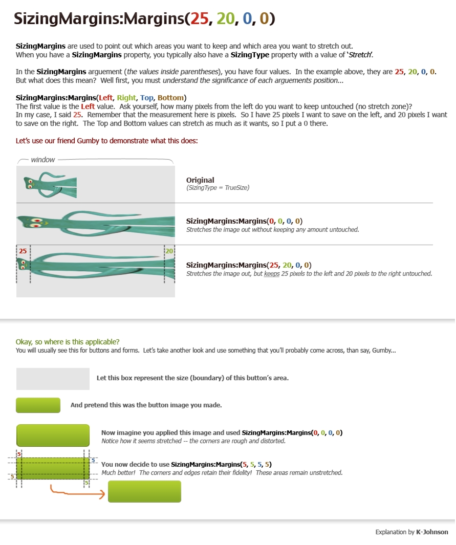
Профиль | Отправить PM | Цитировать


Можешь объяснить принцип работы SIZINGTYPE:ENUM? Как работает SizingMargins: Margins я знаю, в шапке есть фото, а вот SIZINGTYPE:ENUM нет.

Отправлено: 18:22, 16-11-2011 | #1101


Для отключения данного рекламного блока вам необходимо зарегистрироваться или войти с учетной записью социальной сети.

Если же вы забыли свой пароль на форуме, то воспользуйтесь данной ссылкой для восстановления пароля.


Пользователь


Сообщения: 74
Благодарности: 44

Профиль | Отправить PM | Цитировать


RaDMaN! Лучше сам поэкспериментируй и сам поймешь. Там три значения STRETCH,TILE,TRUESIZE как твоё изображение растягивает. TRUESIZE, использует оригинальный размер картинки без растяжки. TILE используется для текстурных
картинок. Давай стиль и картинки которые хочешь заменить кто-нибудь сделает.
Это сообщение посчитали полезным следующие участники:

Отправлено: 19:31, 16-11-2011 | #1102


Аватара для I am C.H.E.

Новый участник


Сообщения: 23
Благодарности: 4

Профиль | Отправить PM | Цитировать


Изображения
Тип файла: jpg explorer.jpg
(210.8 Kb, 56 просмотров)

Блин, почему в "Компьютере" название разделов никак не хочет оформляться нужным шрифтом? Мне нужно Tahoma, 8, bold.
Это сообщение посчитали полезным следующие участники:

Отправлено: 19:38, 03-12-2011 | #1103


Аватара для PainteR

Ветеран


Сообщения: 1134
Благодарности: 427

Профиль | Отправить PM | Цитировать


I am C.H.E., не там....
Тут (учтите шрифт меняется не только там, это свойство охватывает и другие элементы):
Fonts, Colors & System Metrics > Fonts & System Metrics свойство ICONTILEFONT:FONT.

-------
My Win7 Visual Style's: AeroAlfa/All Win8 Visual Style's

Используя то, что лежит на всеобщем обозрении, мы теряем свою индивидуальность...

Это сообщение посчитали полезным следующие участники:

Отправлено: 21:52, 03-12-2011 | #1104


Аватара для RaDMaN_

Новый участник


Сообщения: 16
Благодарности: 0

Профиль | Отправить PM | Цитировать


Объясните пожалуйста как работает свойство ATLASRECT:RECT и где можно найти объяснения всех свойств.

Отправлено: 11:48, 04-12-2011 | #1105


Аватара для PainteR

Ветеран


Сообщения: 1134
Благодарности: 427

Профиль | Отправить PM | Цитировать


RaDMaN_, вам не нужно трогать это свойство, его WSB все равно сам подберет под ресурс.
ATLASRECT:RECT - отвечает за размер и расположение ресурса на "карте" Aero (визуально можно посмотреть открыв, например, в Resorator, раздел STREAM).


Описание свойств (English)
Тут не все, но большинство.
Развернуть ->

Код: Выделить весь код
Boolean properties
ALWAYSSHOWSIZINGBAR - TRUE if the sizing bar associated with the part and state should always be shown.
AUTOSIZE - TRUE if the nonclient caption area associated with the part and state vary with text width. 
BGFILL - TRUE if true-sized images associated with the part and state are to be drawn on the background fill.
BORDERONLY - TRUE if the image associated with the part and state should only have its border drawn. 
COMPOSITED - TRUE if the control associated with the part and state will handle its own compositing of images. 
FLATMENUS - Describes how menus are drawn. If TRUE, menus are drawn without shadows. If FALSE, menus have shadows underneath them.
GLYPHONLY - TRUE if the glyph associated with the part and state should be drawn without a background. 
GLYPHTRANSPARENT - TRUE if the glyph associated with the part and state have transparent areas. 
INTEGRALSIZING - TRUE if the truesize image or border associated with the part and state must be sized to a factor of 2. 
MIRRORIMAGE - TRUE if the image associated with the part and state should be flipped if the window is being viewed in right-to-left reading mode.
SOURCEGROW - TRUE if the image associated with the part and state will scale larger in size if necessary. 
SOURCESHRINK - TRUE if the image associated with the part and state will scale smaller in size if necessary. 
UNIFORMSIZING - TRUE if the image associated with the part and state must have equal height and width. 
USERPICTURE - TRUE if the image associated with the part and state is based on the current user. 
Color properties
ACCENTCOLORHINT - The color used as an accent color hint for custom controls.
BLENDCOLOR - The color used as a blend color.
BORDERCOLOR - The color of the border associated with the part and state.
BORDERCOLORHINT - The color used as a border color hint for custom controls.
EDGEDKSHADOWCOLOR - The dark shadow color of the edge associated with this part and state.
EDGEFILLCOLOR - The fill color of the edge associated with this part and state.
EDGEHIGHLIGHTCOLOR - The highlight color of the edge associated with this part and state.
EDGELIGHTCOLOR - The light color of the edge associated with this part and state.
EDGESHADOWCOLOR - The shadow color of the edge associated with this part and state.
FILLCOLOR - The color of the background fill associated with the part and state.
FILLCOLORHINT - The color used as a fill color hint for custom controls.
GLOWCOLOR - The color of the glow for this part and state.
GLYPHTEXTCOLOR - The color that the font-based glyph associated with this part and state will use.
GLYPHTRANSPARENTCOLOR - The transparent glyph color associated with this part and state. If the GLYPHTRANSPARENT value for this part and state is TRUE, parts of the glyph that use this color are not drawn.
GRADIENTCOLOR1 - The first color of the gradient associated with this part and state.
GRADIENTCOLOR2 - The second color of the gradient.
GRADIENTCOLOR3 - The third color of the gradient.
GRADIENTCOLOR4 - The fourth color of the gradient.
GRADIENTCOLOR5 - The fifth color of the gradient.
SHADOWCOLOR - The color of the shadow drawn underneath text associated with this part and state.
TEXTBORDERCOLOR - The color of the text border associated with this part and state.
TEXTCOLOR - The color of the text associated with this part and state.
TEXTSHADOWCOLOR - The color of the text shadow associated with this part and state.
TRANSPARENTCOLOR - The transparent color associated with this part and state. If the TRANSPARENT value for this part and state is TRUE, parts of the graphic that use this color are not drawn.
Enum properties
BGTYPE - The basic drawing type for this part.
BORDERTYPE - The type of border drawn if this part is a border fill.
CONTENTALIGNMENT - The alignment of text in the caption associated with this part.
FILLTYPE - The type of fill shape drawn if this part is a border fill.
GLYPHTYPE - The type of glyph drawn on this part.
GLYPHFONTSIZINGTYPE - The type of method used to select between different-sized glyphs.
HALIGN - The horizontal alignment if this part uses a true-size image.
ICONEFFECT - The type of effect to be displayed when this part is drawn using an effect.
IMAGELAYOUT - The type of alignment used when multiple images are drawn.
IMAGESELECTTYPE - The type of method used to select between sized images for this part.
OFFSETTYPE - The alignment of this part on the window.
SIZINGTYPE - The method used to size an image if this part uses an image file.
TEXTSHADOWTYPE - The type of shadow effect to draw behind text associated with this part.
TRUESIZESCALINGTYPE - The type of scaling used if this part uses a true-sized image.
VALIGN - The vertical alignment if this part uses a true-size image.
Filename properties
GLYPHIMAGEFILE - The  glyph image associated with this part and state.
IMAGEFILE - The image associated with this part and state, or the image for multiple images associated with this part and state.
IMAGEFILE1 - The first scaled image associated with this part and state, for support of different resolutions.
IMAGEFILE2 - The second scaled image associated with this part and state, for support of different resolutions.
IMAGEFILE3 - The third scaled image associated with this part and state, for support of different resolutions.
IMAGEFILE4 - The fourth scaled image associated with this part and state, for support of different resolutions.
IMAGEFILE5 - The fifth scaled image associated with this part and state, for support of different resolutions.
Font properties
GLYPHFONT - The font that the glyph associated with this part will be drawn with, if font-based glyphs are used.
Int properties
ALPHALEVEL - The alpha value (0-255) used for effects.
ALPHATHRESHOLD - The minimum alpha value (0-255) that a pixel must have to be considered opaque.
BORDERSIZE - The thickness of the border drawn if this part uses a border fill.
GLYPHINDEX - The character index into the selected font that will be used for the glyph, if the part uses a font-based glyph.
GRADIENTRATIO1 - The amount of the first gradient color (GRADIENTCOLOR1) to use in drawing the part. This value can be from 0 to 255, but this value plus the values of each of the GRADIENTRATIO values must add up to 255.
GRADIENTRATIO2 - The amount of the second gradient color (GRADIENTCOLOR1) to use in drawing the part. This value can be from 0 to 255, but this value plus the values of each of the GRADIENTRATIO values must add up to 255.
GRADIENTRATIO3 - The amount of the third gradient color (GRADIENTCOLOR1) to use in drawing the part. This value can be from 0 to 255, but this value plus the values of each of the GRADIENTRATIO values must add up to 255.
GRADIENTRATIO4 - The amount of the fourth gradient color (GRADIENTCOLOR1) to use in drawing the part. This value can be from 0 to 255, but this value plus the values of each of the GRADIENTRATIO values must add up to 255.
GRADIENTRATIO5 - The amount of the fifth gradient color (GRADIENTCOLOR1) to use in drawing the part. This value can be from 0 to 255, but this value plus the values of each of the GRADIENTRATIO values must add up to 255.
HEIGHT - The height of the part.
IMAGECOUNT - The number of state images present in an image file.
MINDPI1 - The minimum dots per inch (dpi) that the first image file was designed for.
MINDPI2 - The minimum dpi that the second image file was designed for.
MINDPI3 - The minimum dpi that the third image file was designed for.
MINDPI4 - The minimum dpi that the fourth image file was designed for.
MINDPI5 - The minimum dpi that the fifth image file was designed for.
PROGRESSCHUNKSIZE - The size of the progress control "chunk" shapes that define how far an operation has progressed.
PROGRESSSPACESIZE - The total size of all of the progress control "chunks".
ROUNDCORNERHEIGHT - The roundness (0 to 100 percent) of the part's corners.
ROUNDCORNERWIDTH - The roundness (0 to 100 percent) of the part's corners.
SATURATION - The amount of saturation (0-255) to apply to an icon drawn using an effect.
TEXTBORDERSIZE - The thickness of the border drawn around text characters.
TRUESIZESTRETCHMARK - The percentage of a true-size image's original size at which the image will be stretched.
WIDTH - The width of the part.
Intlist properties
TRANSITIONDURATIONS - The duration of each frame when doing a transition between two images.
Margins properties
CAPTIONMARGINS - The margins that define where caption text may be placed within a part.
CONTENTMARGINS - The margins that define where content may be placed within a part. 
SIZINGMARGINS - The margins used for sizing a non-true-size image.
Position properties
MINSIZE - The minimum size that the normal image file can be used for before moving to the next smallest image file. 
MINSIZE1 - The minimum size that the first small image file can be used for.
MINSIZE2 - The minimum size that the second small image file can be used for.
MINSIZE3 - The minimum size that the third small image file can be used for.
MINSIZE4 - The minimum size that the fourth small image file can be used for.
MINSIZE5 - The minimum size that the fifth small image file can be used for.
NORMALSIZE - The size of the normal image associated with this part. 
OFFSET - The position offset from the alignment for this part. The alignment is defined by the OFFSETTYPE value.
TEXTSHADOWOFFSET - The offset from the text at which text shadows are drawn.
Rect properties
ATLASRECT - The placement and size of an image in the Aero map.
DEFAULTPANESIZE - The default size of the part.
Size properties
CAPTIONBARHEIGHT - Caption bar height.
CAPTIONBARWIDTH - Caption bar width.
MENUBARHEIGHT - Menu bar height.
MENUBARWIDTH - Menu bar width.
PADDEDBORDERWIDTH - Padded border width.
SCROLLBARHEIGHT - Scroll bar height.
SCROLLBARWIDTH - Scroll bar width.
SIZINGBORDERWIDTH - Width of a sizing border.
SMCAPTIONBARHEIGHT - Small caption bar height.
SMCAPTIONBARWIDTH - Small caption bar width.
String properties
CSSNAME - The name of the Cascading Style Sheets (CSS) file associated with the theme specified by the theme.
TEXT - The text displayed by the part.
XMLNAME - The name of the XML file associated with the theme specified by the theme.
(c) Panda X

-------
My Win7 Visual Style's: AeroAlfa/All Win8 Visual Style's

Используя то, что лежит на всеобщем обозрении, мы теряем свою индивидуальность...


Последний раз редактировалось PainteR, 04-12-2011 в 16:48.

Это сообщение посчитали полезным следующие участники:

Отправлено: 15:43, 04-12-2011 | #1106


Новый участник


Сообщения: 17
Благодарности: 0

Профиль | Отправить PM | Цитировать


подскажите как убрать Анимацию, и что при копирований, вид был автоматический расширенный

Отправлено: 11:50, 07-12-2011 | #1107


Аватара для PainteR

Ветеран


Сообщения: 1134
Благодарности: 427

Профиль | Отправить PM | Цитировать


Цитата burjui-v:
подскажите как убрать Анимацию »
Убрать в стиле не получится...анимация прописана в shell32.dll.
Цитата burjui-v:
и что при копирований, вид был автоматический расширенный »
Стиль тут тоже не причем.
Да и я такого вообще не встречал.

-------
My Win7 Visual Style's: AeroAlfa/All Win8 Visual Style's

Используя то, что лежит на всеобщем обозрении, мы теряем свою индивидуальность...


Отправлено: 19:11, 12-12-2011 | #1108


Аватара для v4386

Новый участник


Сообщения: 27
Благодарности: 1

Профиль | Отправить PM | Цитировать


Подскажите,пожалуйста,как поменять цвет шрифта,а также сам шрифт в кнопке "подключение"-"отключение"?

Последний раз редактировалось pahan22, 01-08-2012 в 22:35.


Отправлено: 20:16, 13-12-2011 | #1109


Новый участник


Сообщения: 4
Благодарности: 0

Профиль | Отправить PM | Цитировать


поставил на папки фон, меняющийся при изменении вида значков в папке. сделал всё как тут написано. но при скролинге, изображение прыгает. задавал в WSB разные значения, кажется что уже все перепробовал. но надеюсь что нет. если кто нибудь с этим уже сталкивался, то хотелось бы узнать есть решение этой проблемы или все же придется использовать сторонние программы для смена фона в папках? =\

Отправлено: 21:51, 13-12-2011 | #1110


Компьютерный форум OSzone.net » Изменение внешнего вида Windows » Оформление Windows 11/ 10 / 8 / 7 / Vista » Инфо - Работаем с Vista\Windows Style Builder

Участник сейчас на форуме Участник сейчас на форуме Участник вне форума Участник вне форума Автор темы Автор темы Шапка темы Сообщение прикреплено

Похожие темы
Название темы Автор Информация о форуме Ответов Последнее сообщение
Ресурсы - Windows Whistler Style ackerman2007 Оформление Windows XP 45 18-05-2019 23:50
Ресурсы - Style for Windows Media Player 11 di2blo Оформление Windows XP 19 07-08-2010 23:33
WinFuture xp-Iso-Builder 3.0.3 - делаем свой дистрибутив Windows XP MKN Автоматическая установка Windows 2000/XP/2003 2 23-06-2010 12:12
Разное - [решено] Совместим ли C++Builder 2007 с Windows 7? ineXPert Microsoft Windows 7 5 17-01-2010 13:27


Переход